By Hermes Joy Tunac
Photography by Jar Concengco
Not a few people describe architect Carlo Calma’s mind as “out of the ordinary.” And in this home, dubbed as “galvanized house,” which is also heavily influenced by the owner’s love for music, you’ll easily see why.

When London-trained architect and interior designer Carlo Calma was asked by a good friend to design his family’s home situated in the middle of a gated community, a rather established enclave composed of fairly old homes, Carlo immediately said yes. He’s up to any challenge, and creating a house that would stand out in a crowded village in Metro Manila is definitely one of them.
“How can a generic typology of the house be different in modern times or adapt to its current site condition?” This was the question Carlo and his firm wanted to address during their first encounter with the family’s old property, which they later demolished to make way for a new one. A few months later, they were able to answer their own question by creating a “galvanized house” with, what Carlo describes as, music-inspired accents.
“From the house’s façade, the roof looks a bit twisted. There are three bands with different functions—one is for a sculptural stand, second is for a waterfall and third is to canalize water,” Carlo explains to PeopleAsia ENCLAVES. “These three bands represent typical houses in Manila, which are made of yero [galvanized iron]. But instead of using the typical yero as just roofing, I created a modern interpretation that would make this material transform into something luxurious.”

True enough, the house, at first glance, hardly has any evidence of the use of yero. Instead, the first thing that would catch your eyes is the waterfall flowing through a pond of koi fish. The sound of moving water is in itself already relaxing. So, as you walk inside the house, you can’t help but feel like you’re home.
Carlo’s client is also fond of music and entertaining. That’s why, apart from being functional, the three bands that make up the house’s façade resemble staves, or the set of five horizontal lines one would find on a music sheet, as they symbolize the owner’s passion for the art of sound. At nighttime, the bands light up and double as the house’s chandelier. “We used different genes and percentages of metals for the house’s exterior to add a flair of drama and luxury,” the architect adds.
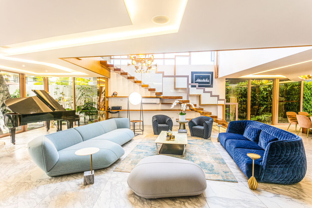
As you enter the house, the door also reflects the client’s love affair with music. The main door’s handle, for starters, is shaped like an electric guitar. That’s not all! Once you’re inside, you’ll be greeted by a piano from the Cultural Center of the Philippines and a trumpet-inspired chandelier.

In the living area, sofas are mostly in pastel hues, as requested by the client’s wife, which, according to Carlo, “[pastel sofas] added vibrancy to the avant-garde scheme.” Most of the furniture pieces in this part of the house are from an Italian furniture boutique called Cassina and designed by Spanish designer Patricia Urquiola.
“When it comes to buying furniture pieces, it’s important to take note that the design should always come first before the brand. I’ve actually designed houses with furniture pieces made of wood that I got from an old attic, which I repurposed. You don’t always have to buy something new,” Carlo advises.
For instance, his client went to Los Angeles and attended a hotel auction along Santa Monica Drive. Before long, he took home a round lamp that’s now displayed beside the piano in the living area and a coffee table in the dining area where a speaker sits.
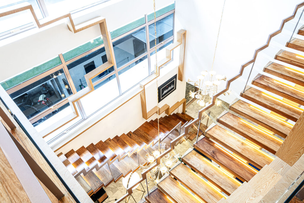
For the staircase, Carlo pulled off a double-height ceiling. “It’s like blurring the boundaries of the actual iconography of a staircase. Normally, if you see the jagged edge of a staircase, that’s just it. But in this house, the staircase could be a railing, a bookshelf,” he explains. The stairs are made from thick slabs of wood, while its steps come in different sizes to make it look more like an installation piece rather than just a typical stairway.
Art is everywhere
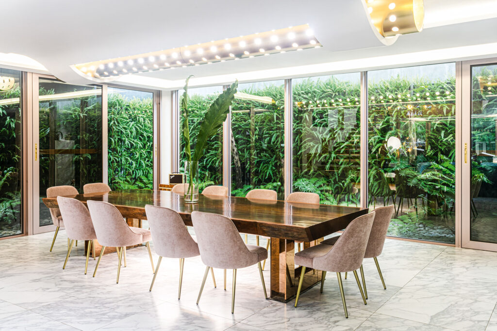
In the dining area, the vintage dining table is a gift from the client’s father. “It’s actually made of centuries-old wood. We used this as the starting point in choosing all the other materials and furniture pieces of the house,” shares Carlo. A fern garden is also situated just outside of the kitchen area, adding a welcome green accent to the high-ceilinged house.

On top of the dining table is an illusion of a floating carpet supporting a cigarette-shaped structure, which, in turn, creates an ambient light with a bit of drama.
He also manages to compare acquiring home appliances to attending a wedding. You have something old, something borrowed and something new. “This house is a combination of all of that. When you’re a good designer, you can make something authentic out of this arrangement,” he says.
The second floor is where the entertainment area, guest room and training room are, while the third floor houses the master bedroom and children’s room. Carlo maintained the zigzag accent in the entire house, while allowing the couple’s collection of paintings and murals to grace almost every key area of the house.
Carlo’s overall vision of the house is to make his client’s everyday living luxurious despite the use of relatively inexpensive materials like yero. “Also, we wanted to create a house that could be masculine even with splashes of pastel. The interiors are designed to create fluidity, hopefully blurring the boundaries of wall, floor and ceiling,” Carlo concludes.


