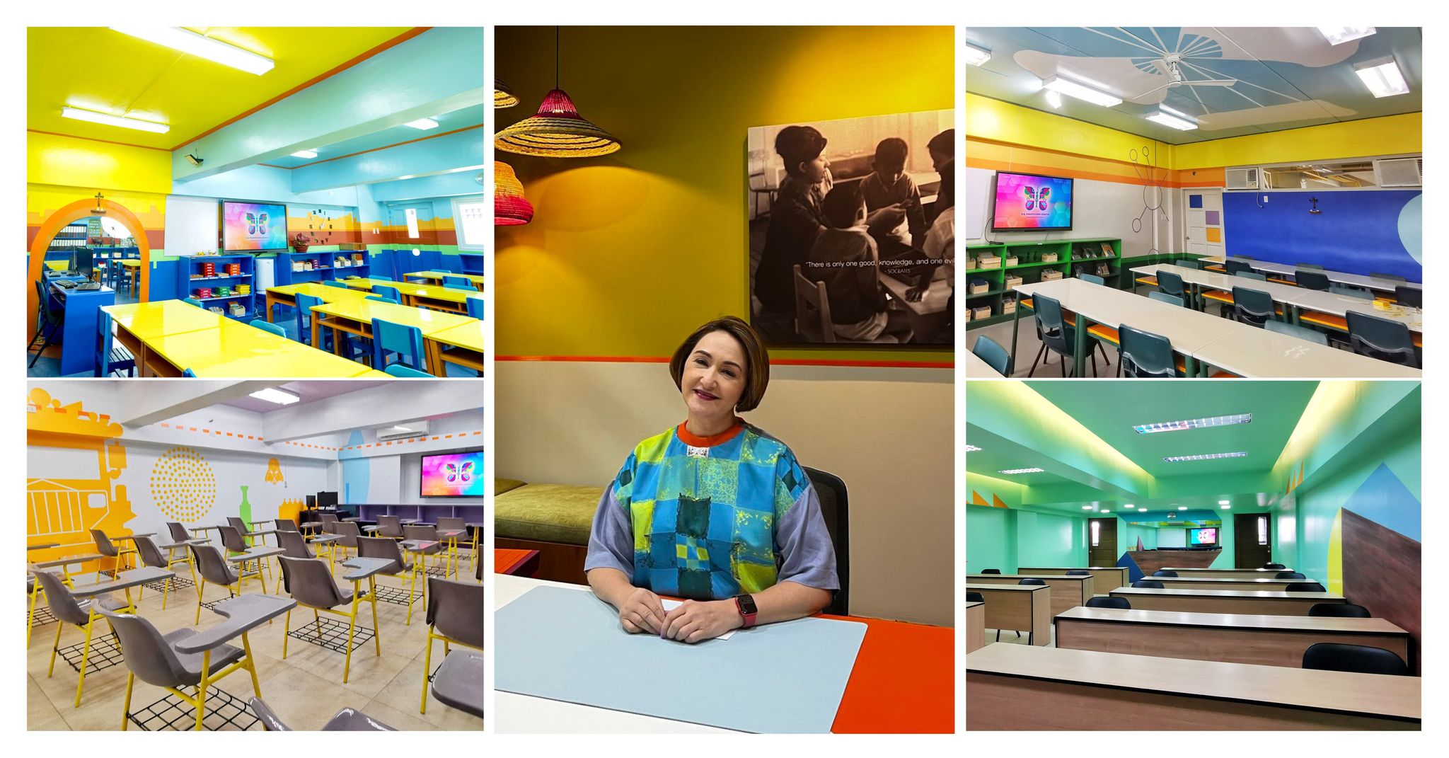
To make learning more fun and stimulating for its students as they start trooping back to school and doing face-to-face classes, albeit on a staggered and hybrid basis, educator Sara Soliven de Guzman, chief operating officer of OB Montessori, collaborated with designers Rita Nazareno and Gabby Lichauco in putting splashes of various colors, literally, on what used to be predominantly white classroom walls.
By Alex Y. Vergara
Life is never black and white, so why should a place of learning, especially as prestigious and as venerable as OB Montessori, be limited to such safe neutral shades?
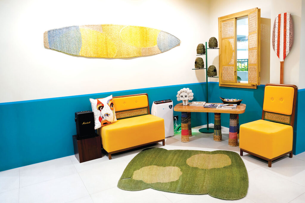
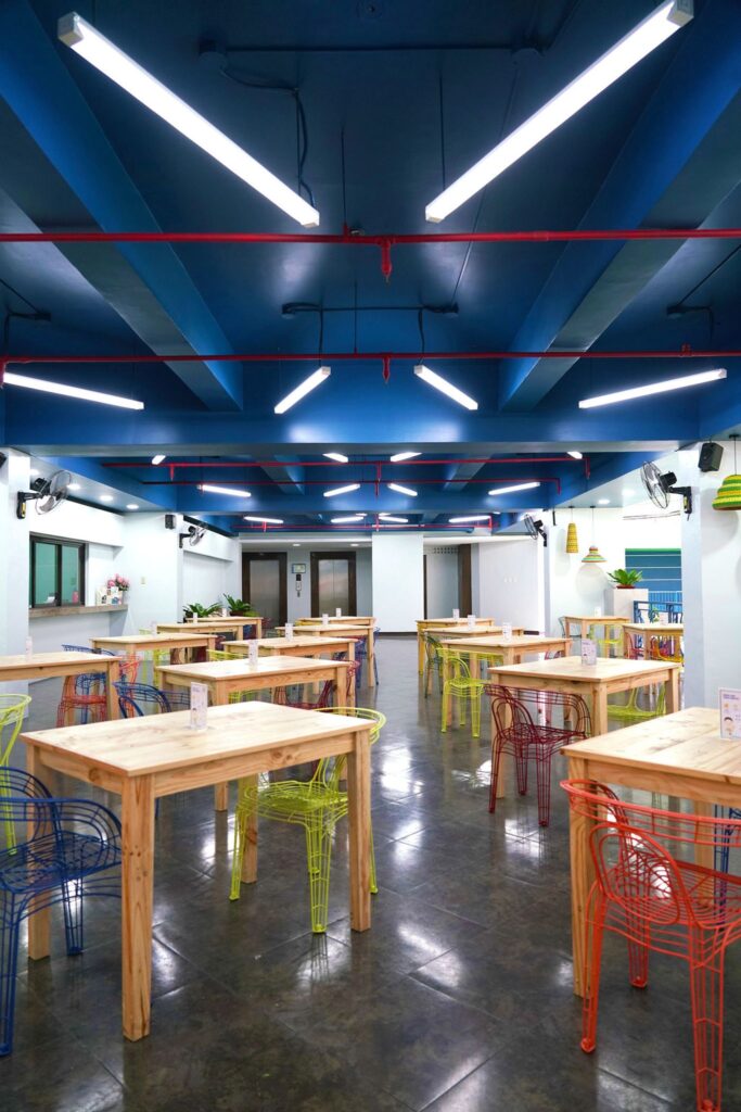
Dubbed as “Creativity in the Syllabus,” OB Montessori’s months-long makeover, which is far from just superficial, was unveiled recently for journalists and other outsiders to see at the school’s main campus in Greenhills, San Juan. The entire school network, which has branches in Angeles, Las Piñas, Sta. Ana and Fairview, has undergone a similar makeover.
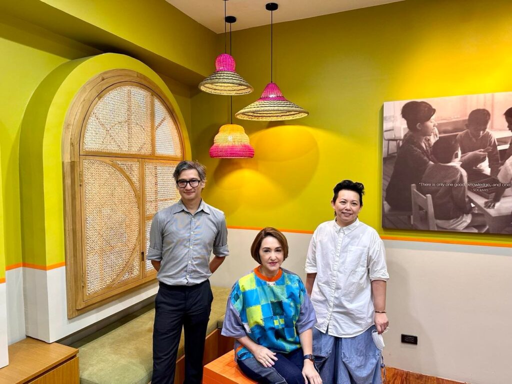
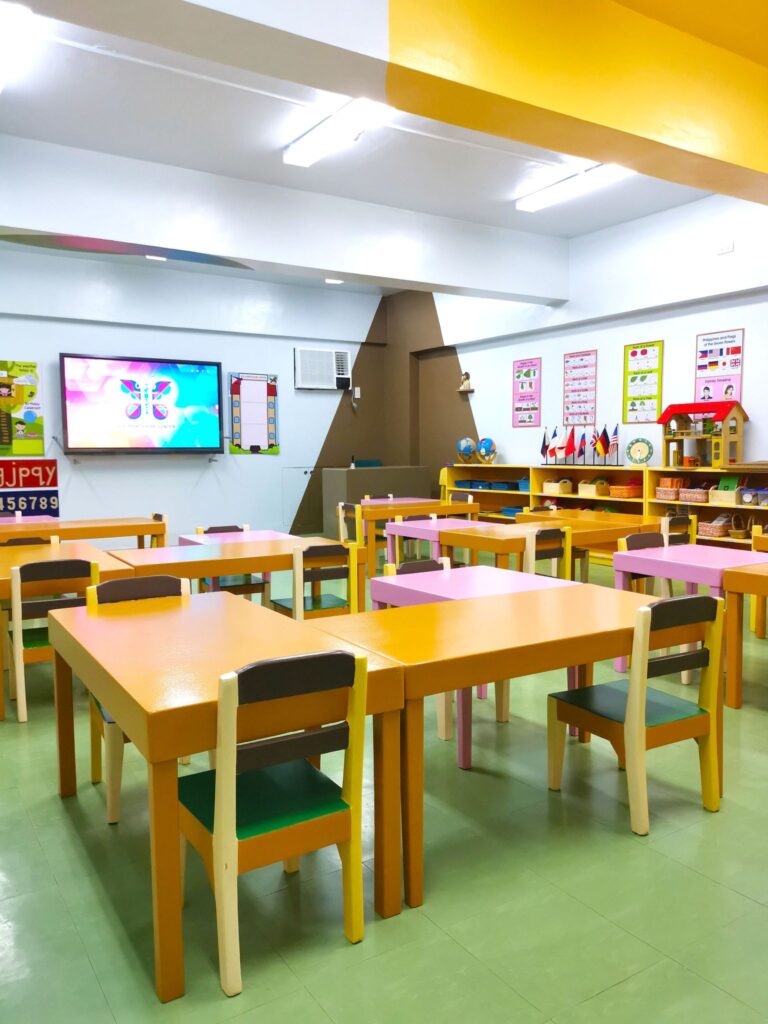
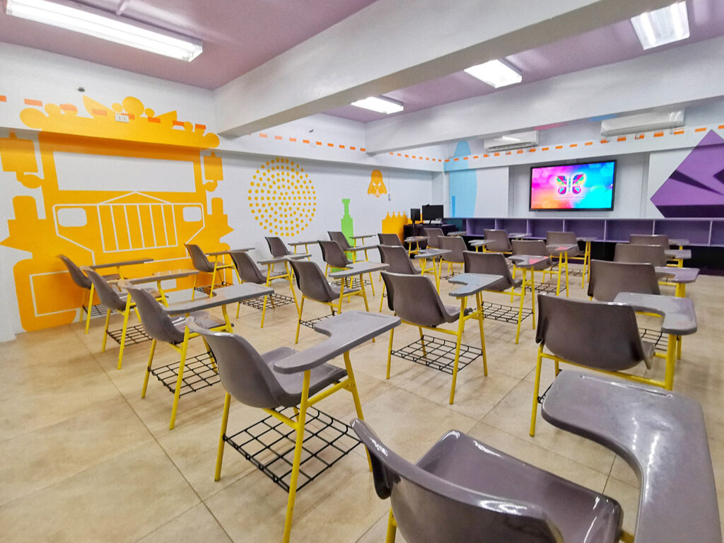
De Guzman and her collaborators, which includes an in-house team at OB Montessori, worked on close to 100 classrooms categorized as Casa, Primary, Intermediate, Junior High and Senior High. Each level caters to particular grades and age levels, which explains the variances in colors as well as silhouettes, patterns and inspirations designed to spark children’s imagination, make learning much more fun and perhaps even allay both parents’ and children’s lingering fears related to the ebbing pandemic.
“Apart from using different color schemes, we resorted to painting various shapes and forms on the classrooms’ walls, which are designed to appeal to the room’s occupants,” says Nazareno. “Whereas rooms categorized as Casa, which are primarily used by kindergarten students, are done in pastels and primary colors with basic shapes splashed on the walls, rooms meant for older, more advanced students are done in more complex shades.”
Prior to rolling up their sleeves, Nazareno says that they did extensive research on what colors, images and silhouettes would resonate well with particular age groups. They also played up the colors of nature, or so-called biosphere shades, especially for rooms meant for primary and intermediate students. Consultations were also made with their main “clients,” which are the students themselves.
The symbols and distinguished personalities meant to inspire and promote learning for, say, intermediate and high school students are also more diverse. A cursory run-through of the giant silhouettes superimposed on the colorful walls include works of such giants in their chosen fields, from Leonardo Da Vinci, Nikolai Tesla and Letitia Geer, to Zaha Hadid and Charles and Ray Eames.
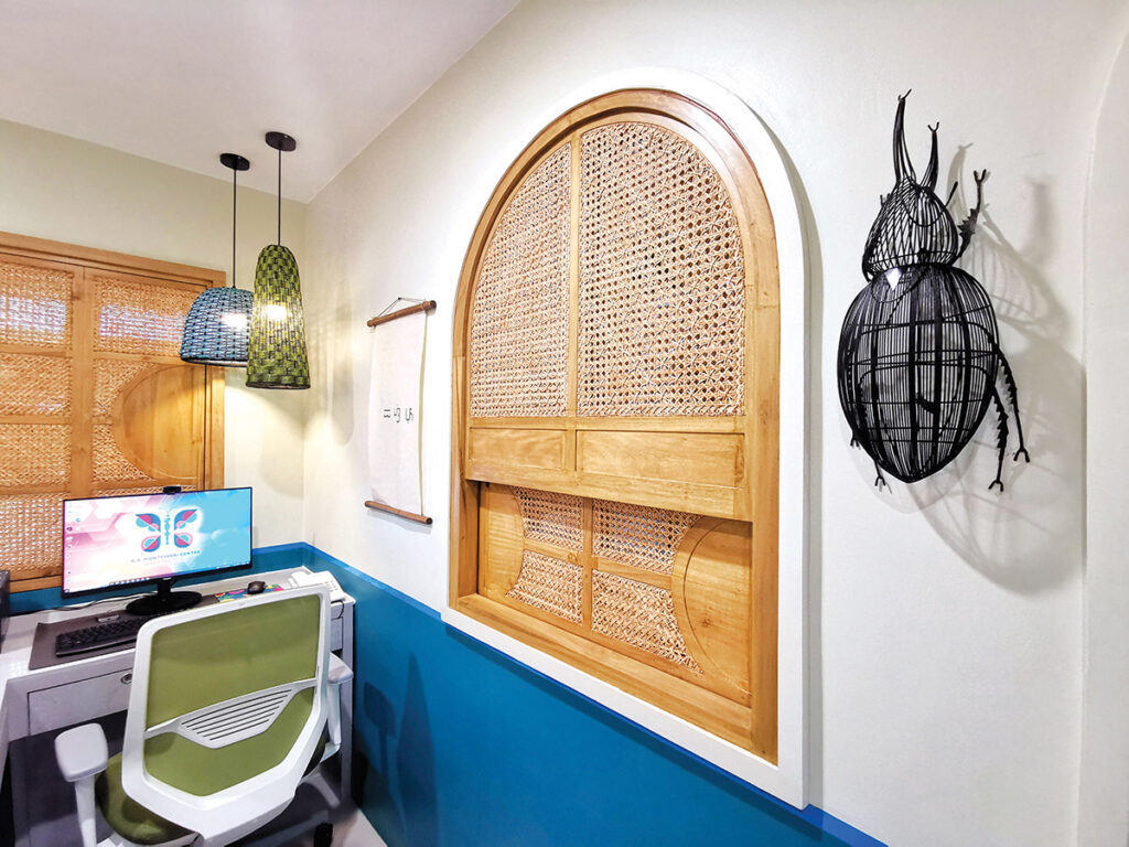
Each room is also equipped with a giant touch-screen monitor, which plays age-specific educational videos exclusively produced for OB Montessori students. Directed by Floy Quintos, the videos are based on the school’s lesson modules and written mostly by OB Montessori’s teachers themselves, who also sometimes appear in the in-house productions either as performers or voice talents.
In more advanced levels, rooms meant for Senior High School students are made more interesting with the inclusion of such iconic images as Darth Vader, the Batibot chair, a terno sleeve, the Panton chair and the Guggenheim Museum in Bilbao.
“There’s an underlying objective and goal to all this, and that’s to make children happy, to make them want to go to school again after being cooped up most of the time at home in front of their tablets and computers,” says De Guzman.
After all, when it comes to learning, nothing beats face to-face interaction. Specially if done in a room as colorful and as stimulating as the ones OB Montessori has made available to its students.

